|
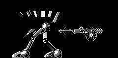
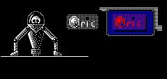
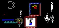
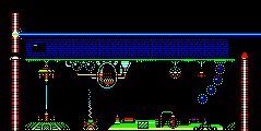
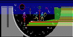
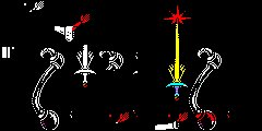
The Inlay Gallery Inlays are non-standard HIRES/TEXT configurations. For a more detailed explanation of this Screen Mode, refer to the HIRES Inlay link on the Graphics Page. |
||
|
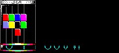
These inlays illustrate the steps to the final scoreboard that was used in the game, MAGNETIX. |
These inlays were used in conjunction with TEXT mode counterparts. The two images were then mixed by alternating them at the screen refresh rate to produce Pseudo Colour effects. |
|
|
|
|
|
|
The MAGNETIX logo was originally going to have a further image moving inside it. Therefore the mask (Bottom image) was required to only allow the moving image through in the displayed areas. |
This same technique was to be used with a Game Over Inlay. |
|
|
|
|
|
|
These are the finished inlays that were used in the game, MAGNETIX. |
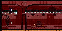
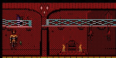
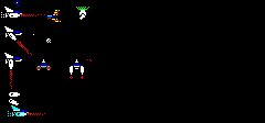
Screens from Wurlde. The top image would appear as the character appears on the scene. Should they then venture beyond a set checkpoint, then the monochrome statue would come alive! |
|
|
|
|
|
|
Inlays from SOUND TRACKER. Many ideas were used in the creation of the SOUND TRACKER logo. The Final image being moderately narrower than the other screens whilst still sporting the Flashy colour mixing. |
A couple of inlays from previous Magazine demonstrations. |
|
|
|
|
|
|
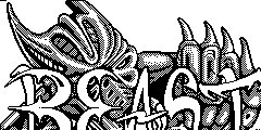
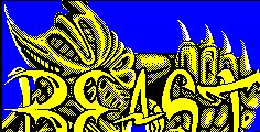
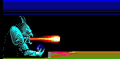
Shadow of the Beast appeared primarily on the AMIGA but then surfaced on the Spectrum, Amstrad CPC and the Commodore 64. I was so impressed by the Spectrums introduction screen, that i converted it to the ORIC by hand. |
Using just EDITOR2 and copying from a Spectrum magazine, i painstakingly converted the picture pixel by pixel to the ORIC. First composing the top image before moving onto the Bottom image. The whole process took around 3 Weeks to accomplish. |
|
|
|
|
|
|
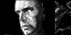
Just a couple of screens to demonstrate the use of white and a lot of dithering to try to achieve a metallic feel to a surface or surfaces. |
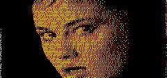
More experiments. The Faces were taken from a C-64 DEMO. I cannot remember what it was called. There are elements of "Prince of Persia" (SAM COUPE!!), ADDAMS FAMILY (Spectrum) and "Heart Land" (C-64) in the bottom picture though. |
|
|
|
|
|
|
The very first Inlay to make able use of the Split line technique. Trying to achieve many different colours within a small area is very difficult on the ORIC. Serial Attributes just refuse to budge into the right places! |
I designed this screen for an X Files DEMO someone was doing at the time. The only problem was, that the X behind the FILE is not emphasised enough. |
|
|
|
|
|
|
The starting screen to the CCSXS demo. This demonstrates the possibilities of Smooth scrolling Colourful backdrops. |
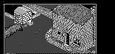
The first large scale isometric screen that i did. Demonstrating that even with just one colour, high quality screens are quite possible on a 240*200 resolution screen. |
|
|
|
|
|
|
These screens were taken from the CEO's Collection of PC>HIRES image files. Note the alternating colours of Red and Yellow in the top image to produce a skin colour (The PC's display does not help reflect the look on the real ORIC!). Note also that the bottom image has a thin line around it. This helps to contain the image for a crisp quality. |
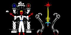
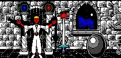
These screens were converted from SHADOW OF THE BEAST for the AMIGA. Note the use of the Split line Technique in the bottom image to promote different colours on the same image. |
|
|
|
|
|
|
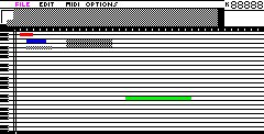
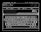
Just a couple of ideas. The top one was for a HIRES based graphics Editor whilst the bottom one was for a HIRES based Music editor. |
SEU and LOZENGE. These game ideas, like many of mine, were never taken further than screen shots. Always remember (when doing a large project) to concentrate always on the Program. Graphics can be added later. |
|
|
|
|
|
|
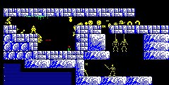
Based upon the game "RICK DANGEROUS", this screen shot demonstrates the advantages of using HIRES over TEXT. TEXT is fast but there are many limitations such as the number a characters (96) and the limited Attribute changes to modify colours. |
A couple of game scoreboard ideas. The top one was for an IJK joystick version of the popular game "LIGHT CYCLE". This game also used the Split line Technique to present two "TRON" style light cycles with different coloured trails. |
|
|
|
|
|
|
A couple more Game logos. the DPANIC2 and TETRIS2 ideas turned into ZIPNZAP. |
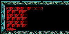
The top Inlay is another early working of the split line technique whilst the bottom "Border" was to be used to frame the Perspective Dungeons in one of the WULDE scenarios. |
|
|
|
|
|
|
I wanted an artists impression of the ORIC2 expansion unit (We can dream, can't we?), so i drew this up. Note again on the BEAST inlay, the use of an outline to frame the image. |
The early workings of the Welcome screen for WURLDE. Ideas are plotted around the screen before combining them into the finished image. |
|
|
|
|
|
|
For further screens, turn to the other Galleries. |
||
