|
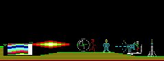
The Wurlde Gallery Part I The method employed on this page, i have called the "Split line Technique". It simply means that the Backdrops (Seen below) can only use even lines, whilst the odd lines are reserved for Sprites. For Example, lines 1,3,5 and 7 are used for the background scene whilst 2,4,6 and 8 are for the sprite. |
|
|
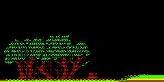
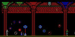
This was about my first attempt at the Split line Technique. The idea was taken from the game, Psychiatric, although within this gallery, it was taken to new extremes. |
I then continued with the idea, realising the advantages of such a technique. One could create sombre backdrops (In blue) to bring atmosphere to the image. I also started to experiment with the sprites required. |
|
|
|
|
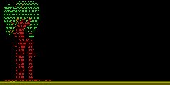
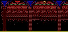
I soon began to take too much advantage of both even and odd lines. YES, creating colourful pictures but the intention to then overlay Sprites was lost since no even/odd lines were spared! |
So I then brought up the height of the images to allow good colour mixing but only towards the top of the page. This area not being accessible by the Character Sprite. |
|
|
|
|
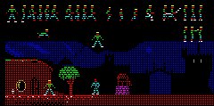
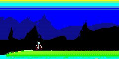
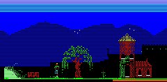
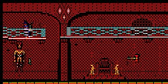
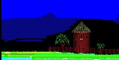
The idea of backdrops grew and grew. With two layers of horizons, it gave a good impression of distance whilst still reflecting the darkness back. |
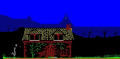
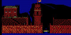
The limitation of even or odd only line usage places some strain on multicoloured objects such as in this scene. Notice the black parts of the cottage, these hold the attributes to change colours. |
|
|
|
|
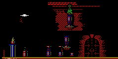
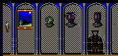
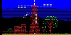
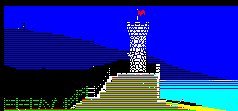
This is my favourite screen. Using the ORICs HIRES Inverse capability, the window ledges in the Church could hide attribute changes whilst still presenting white as the ledge colour. |
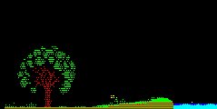
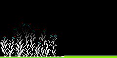
Another example of almost reaching too far with colours. The character must be allowed to pass through the plants and so it can since the colours act only on even lines. |
|
|
|
|
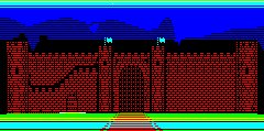
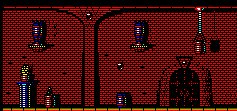
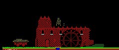
The single colour of the castle tends to make the image appear two dimensional, although the greater the bit-detail and the more shadows cast, the more depth the image can reflect. |
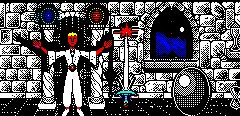
The Welcome screen. Although originally intended for part of the game, the main sprite would be way too large! |
|
|
|
|
Although the predominant colour is red, both the spot colour changes (Yellow and Balcony) and the shadows help to re-instate the scenes impression. Also the almost invisible doorway on the balcony draws the player into the scene. |
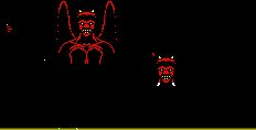
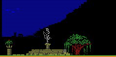
This was intended to demonstrate the use of a sprite within the scene. The statue would not only appear in colour but would also mask the background with his flailing cloak. |
|
|
|
|
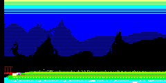
All screens tend to start from images like these. I generally like to begin with an idea. I usually start with an image in my mind but by the time I finish, it usually turns out completely different! |
I enjoy drawing the bricks, forming new styles from merely experimenting with pixels. Does this look right?, from a distance, is this the correct perspective?, can i get away with this?!?!?! |
|
|
|
|
The biggest hurdle is trying to get the perspective right. And trying not to make the image look like a five year olds attempt! |
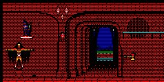
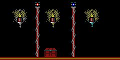
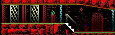
The columns are plotted in Inverse which i intend to be an attribute in the game signifying the sprite to move behind. Notice that this screen was featured in the Demo for Wurlde, the only demo at present although the screen does not require any special encoding and i could have selected any screen. |
|
|
|
|
There is also the importance of ensuring continuity between screens. The intention of the game-play is to allow the player to traverse each still screen. |
So if the Background hills die away from one screen, they should also be at a similar height and continue on the next screen. |
|
|
|
|
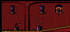
Here is a classic example of bad continuity. Bit of a shame really! |
The use of even and odd lines could also be employed below the characters reach as well as above it. This meant that although the character may appear to walk through a colourful landscape, it still has the freedom interact without incurring attribute problems. |
|
|
|
|
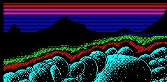
Land height and Sky colour continuity are also very important. Also, the game was intended to allow the traveller to move into the scene to reveal the scene on the horizon. |
So continuity with something in the backdrop was also very important. |
|
|
|
|
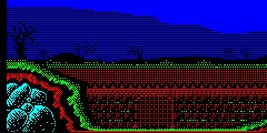
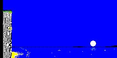
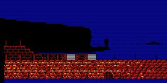
Continuity in the surfaces is also very important. The sea in the Picture below is Cyan yet... |
The sea in this picture below is Blue! |
|
|
|
|
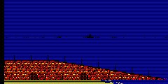
Here are three screens. Each one following on from the last. Almost!! |
Forming a Harbour scene with the backdrop running down to the sea and the odd island placed here and there to signify the all too invisible horizon. |
|
|
|
|
These screens are still Wurlde screens but more experiments than anything else. |
I try to use shadow as much as possible to hide Attribute changes. This is the reason why the default background is black! |
|
|
|
|
For further screens, turn to the other Galleries. |
|